More dev
breakpoint-set · dev · SVG, currentColor
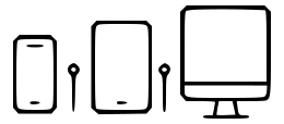
A phone, tablet, and desktop monitor lined up, representing the responsive breakpoints a layout adapts to at different screen sizes. Useful for frontend and web-design illustrations.
Draw with this icon Download SVG
Tags
responsive breakpointsscreen sizesmobiletabletdesktopresponsive designmedia queriesfrontendmedia query breakpointsscreen size breakpointsdevice breakpoints
Free for commercial use, no attribution — license. Or use it on an infinite canvas.
More dev